RipSkirt
brand values and language
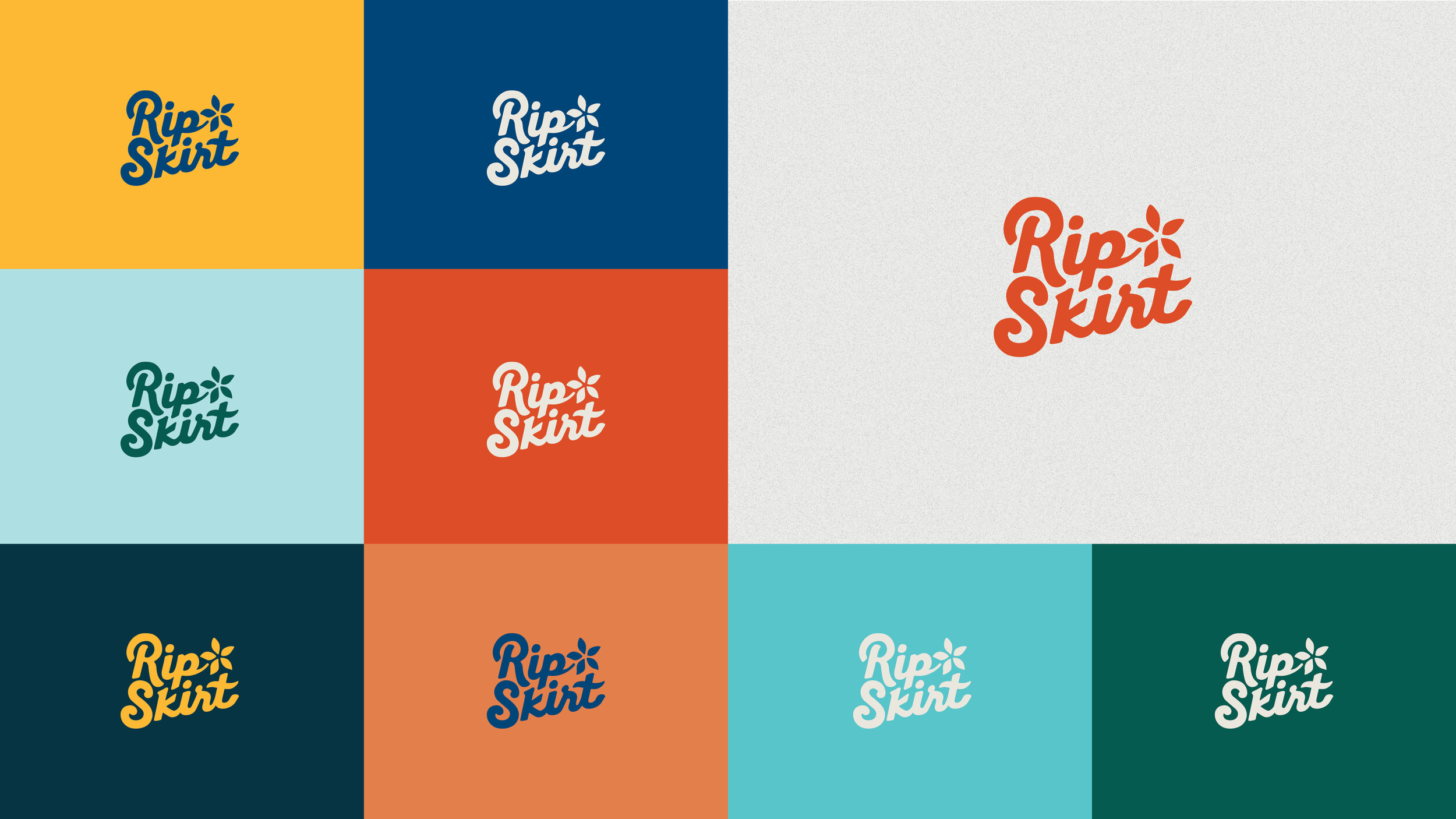
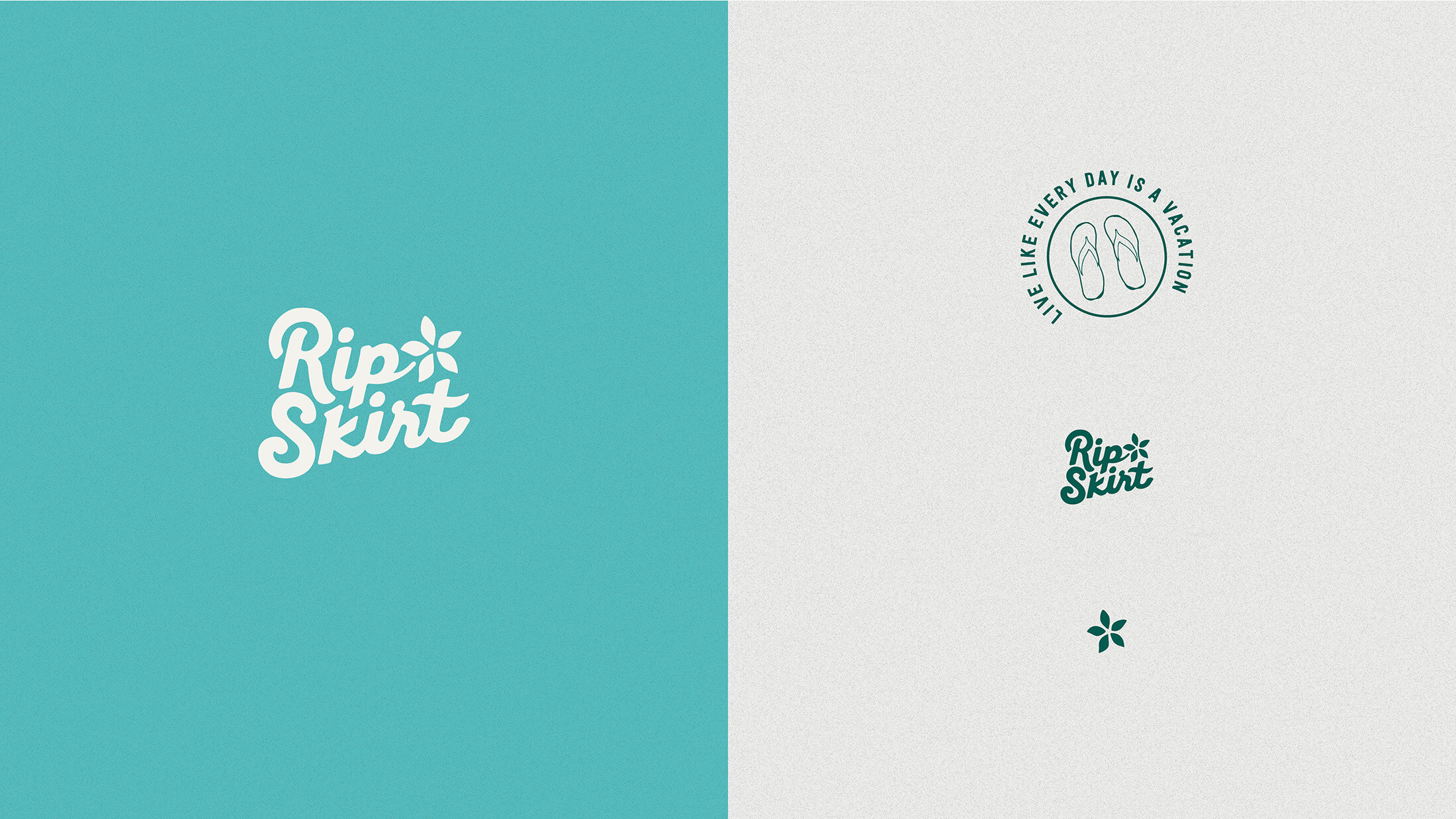
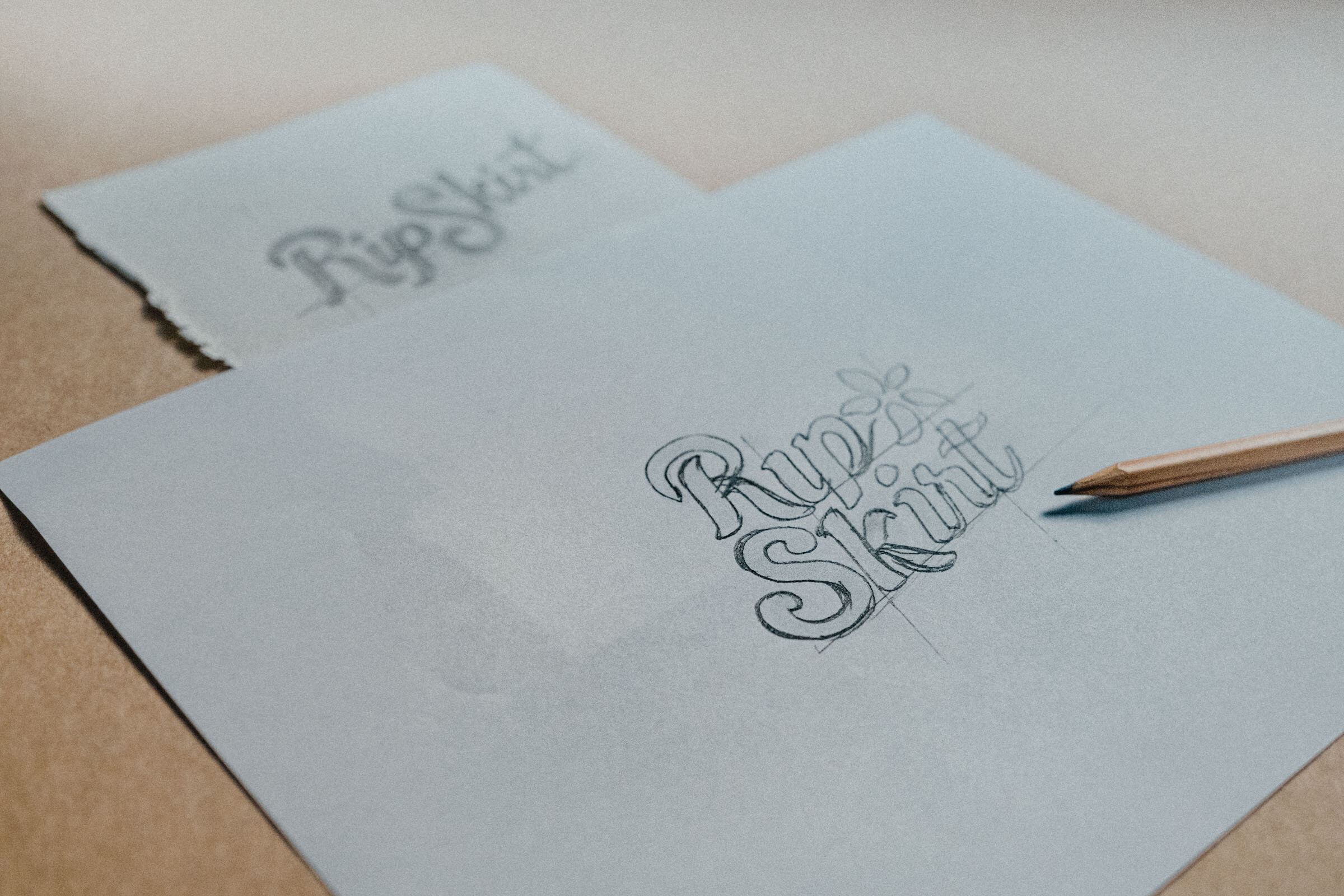
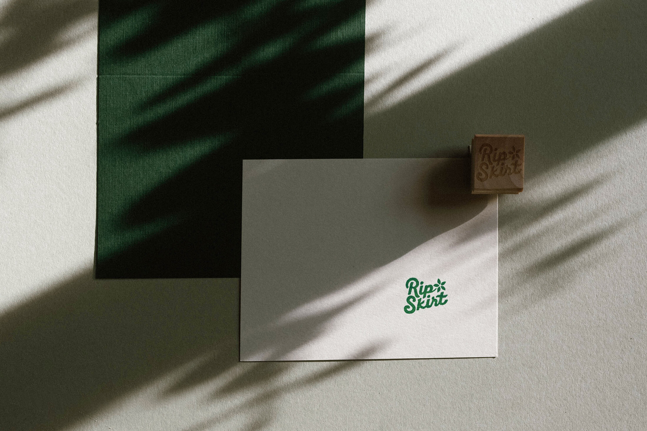
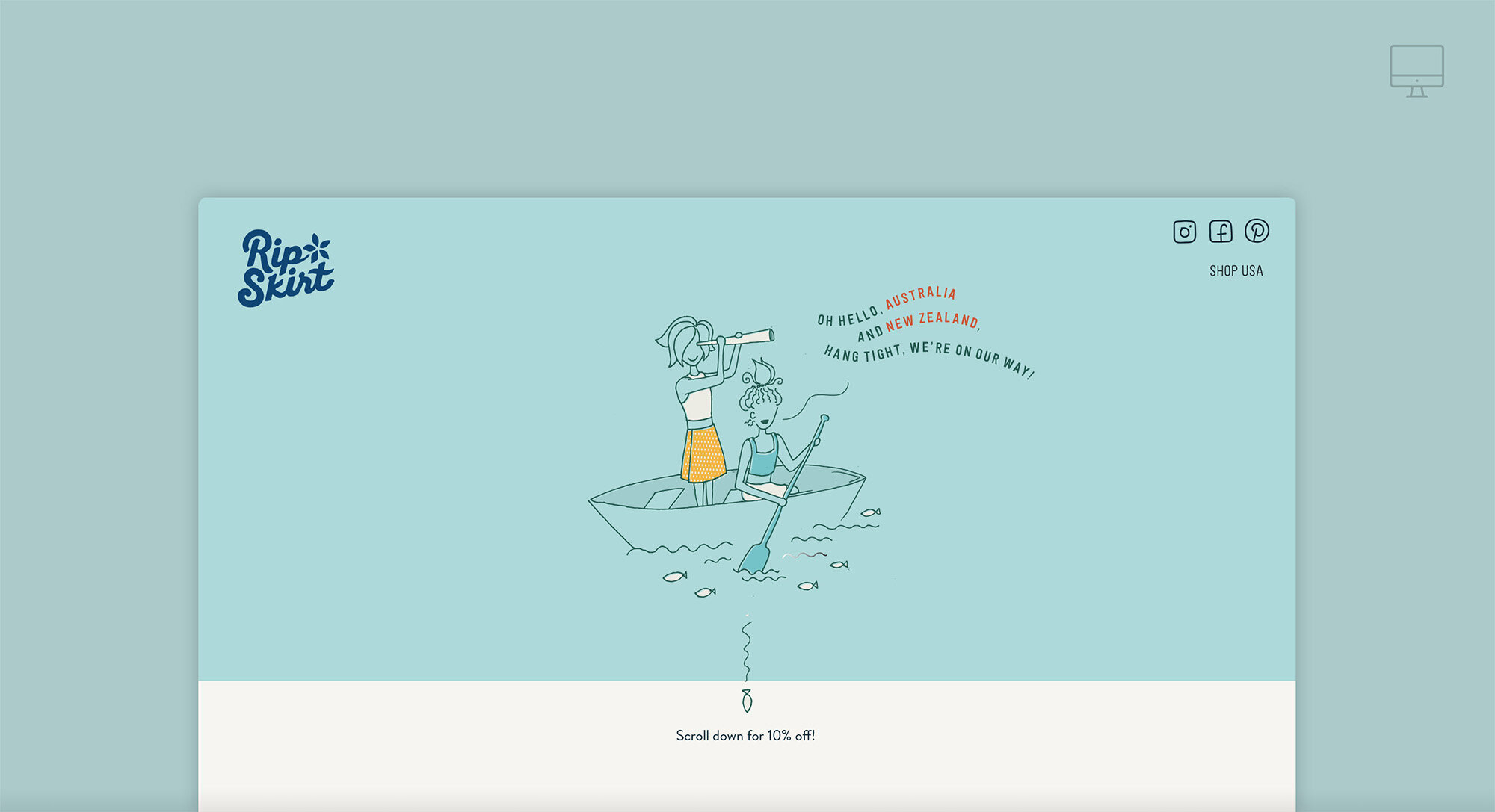
logo design
Colours & Type
illustration & copy

Background
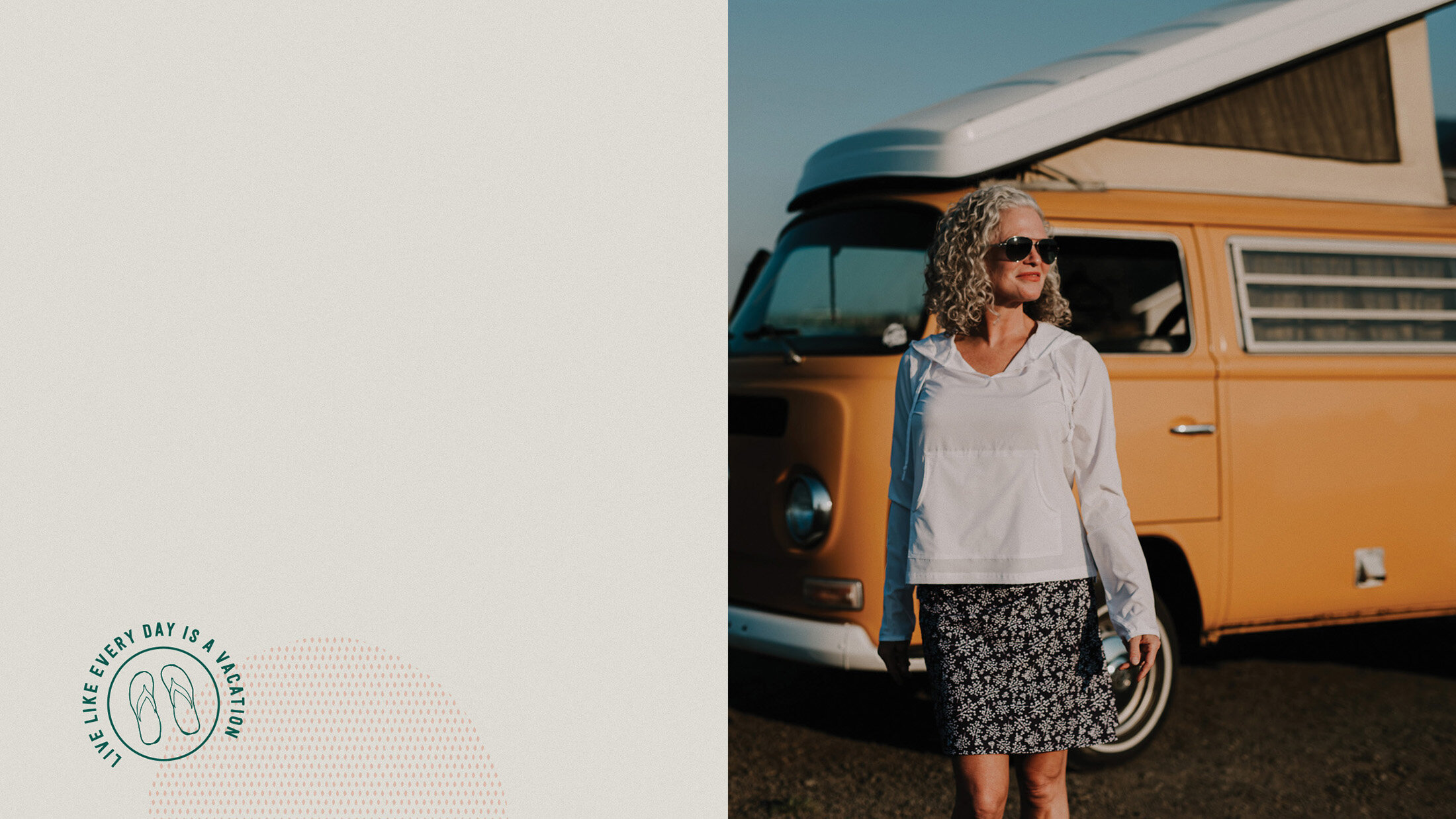
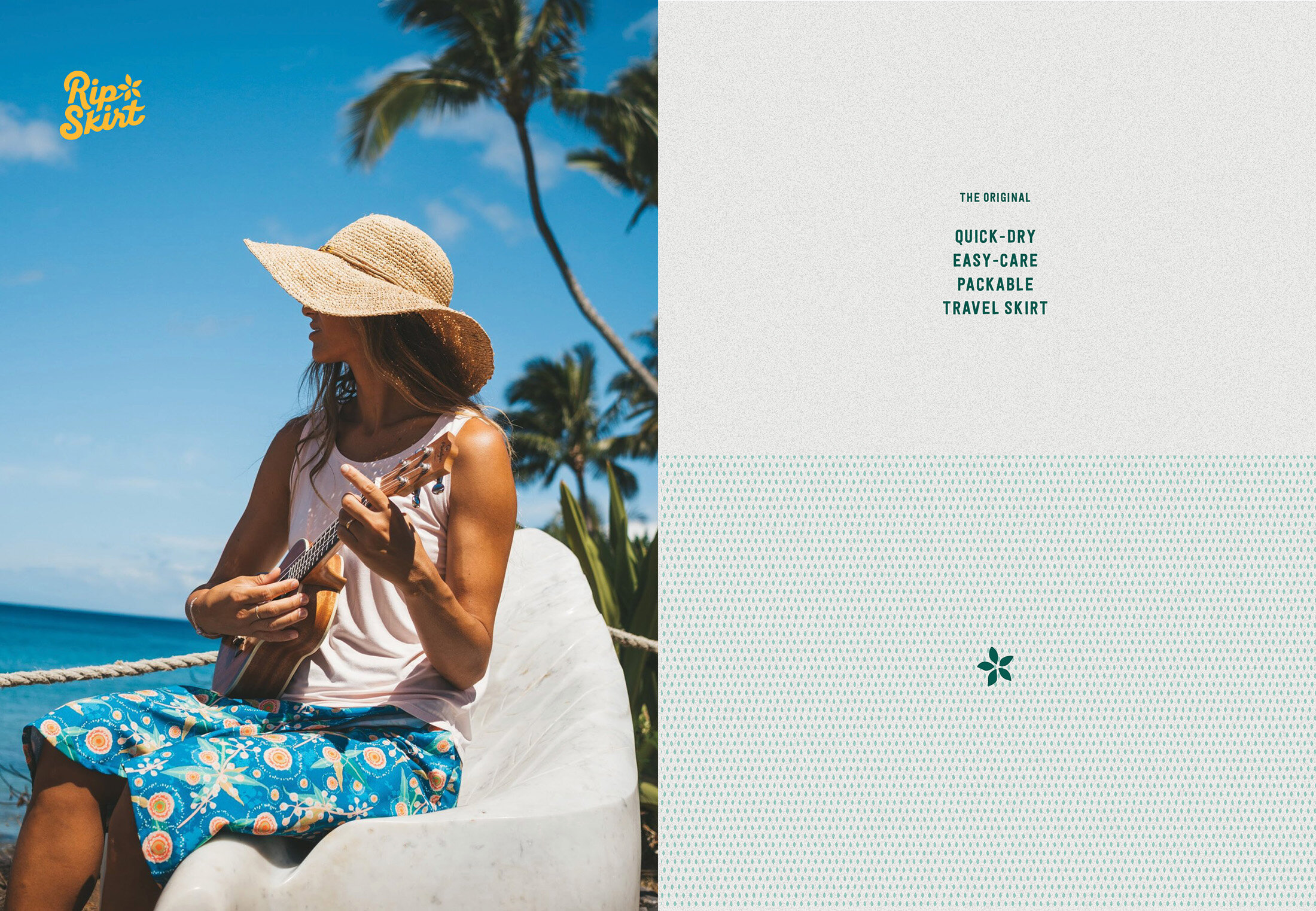
RipSkirt is a lifestyle brand in the athleisure market. They design and produce travel-friendly, tropical clothing for every woman who wants to look good, feel good and always be ready for an adventure. Their signature piece, the original RipSkirt, is a wrap skirt, made with technical watershedding fabric and a velcro closure, available in different lengths and prints.
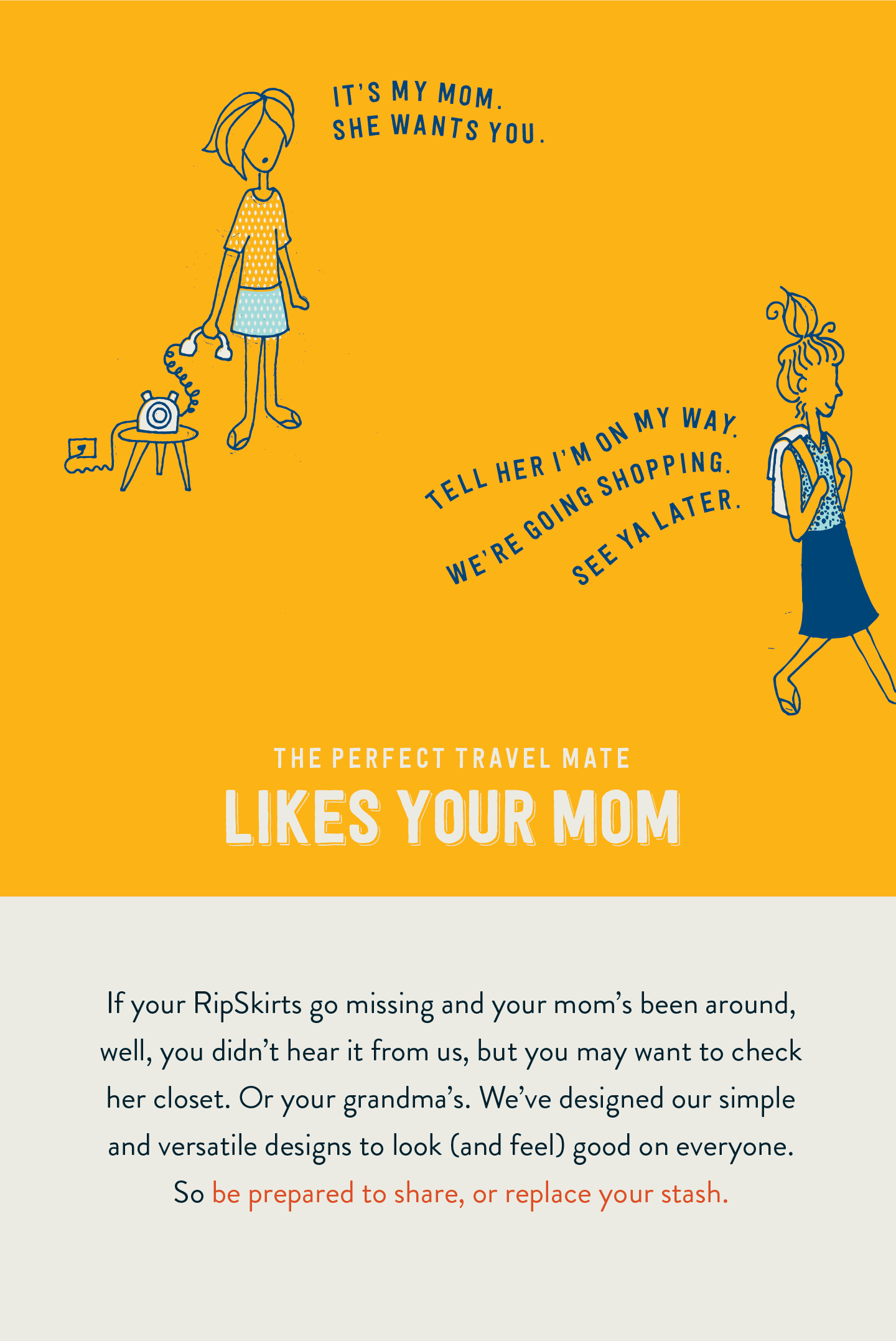
ILLUSTRATIONS & COPY


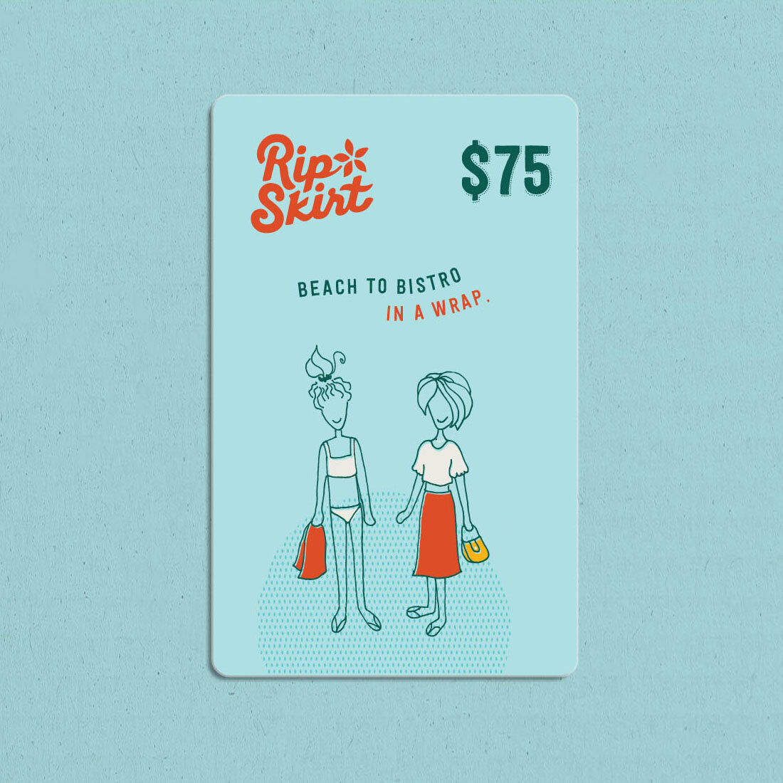
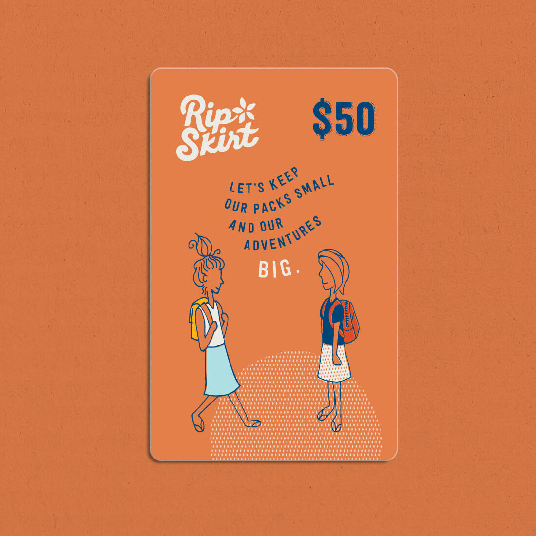
gift cards


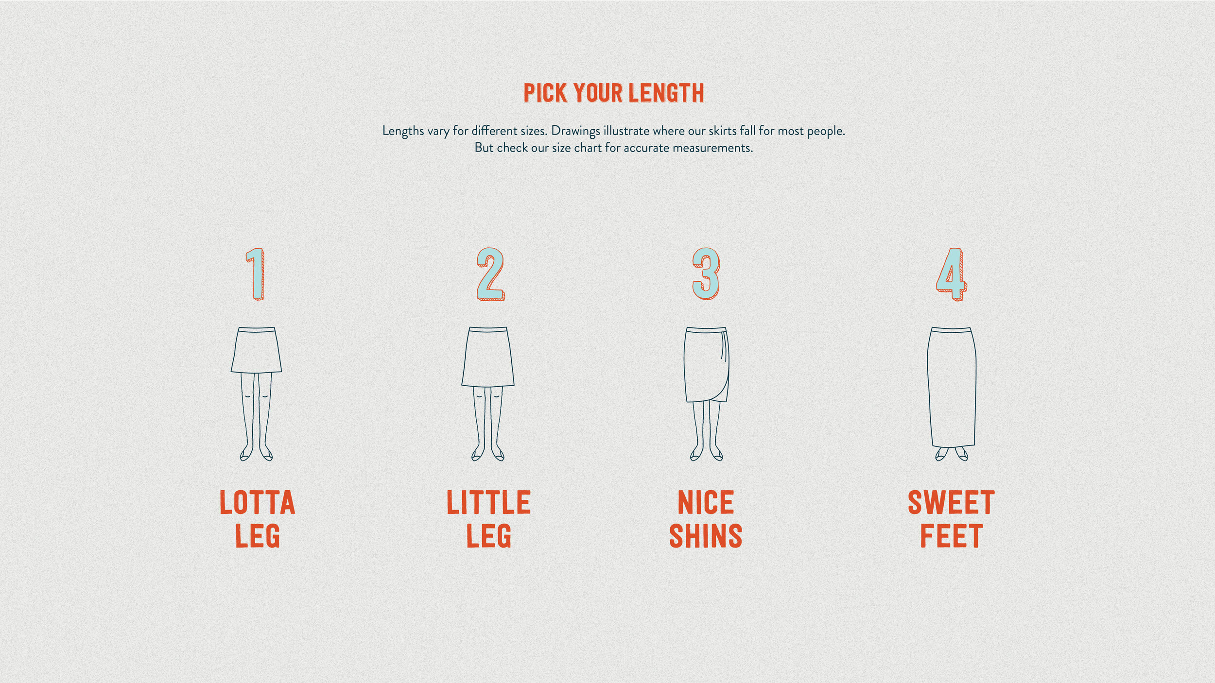
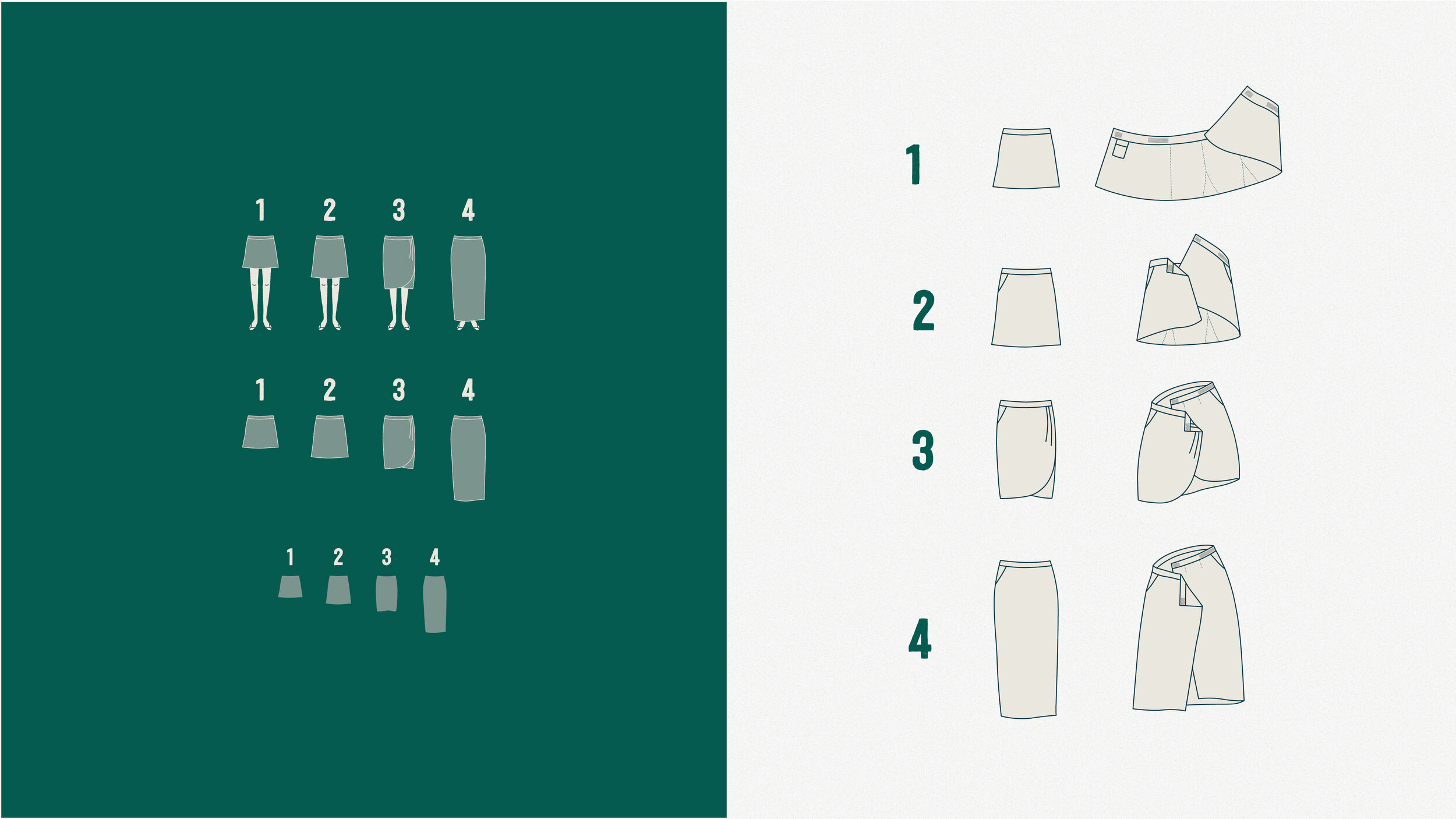
Product drawings
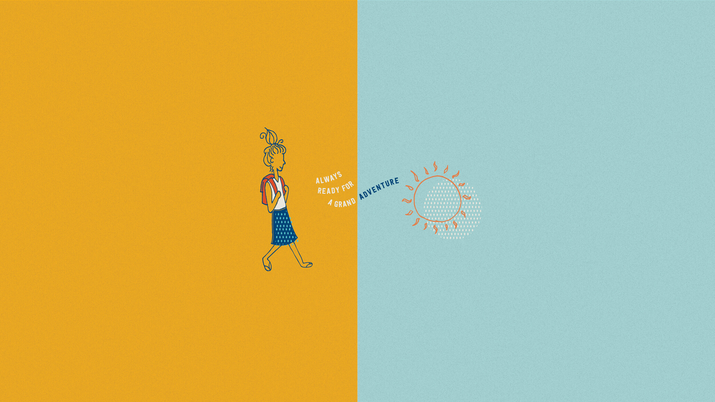
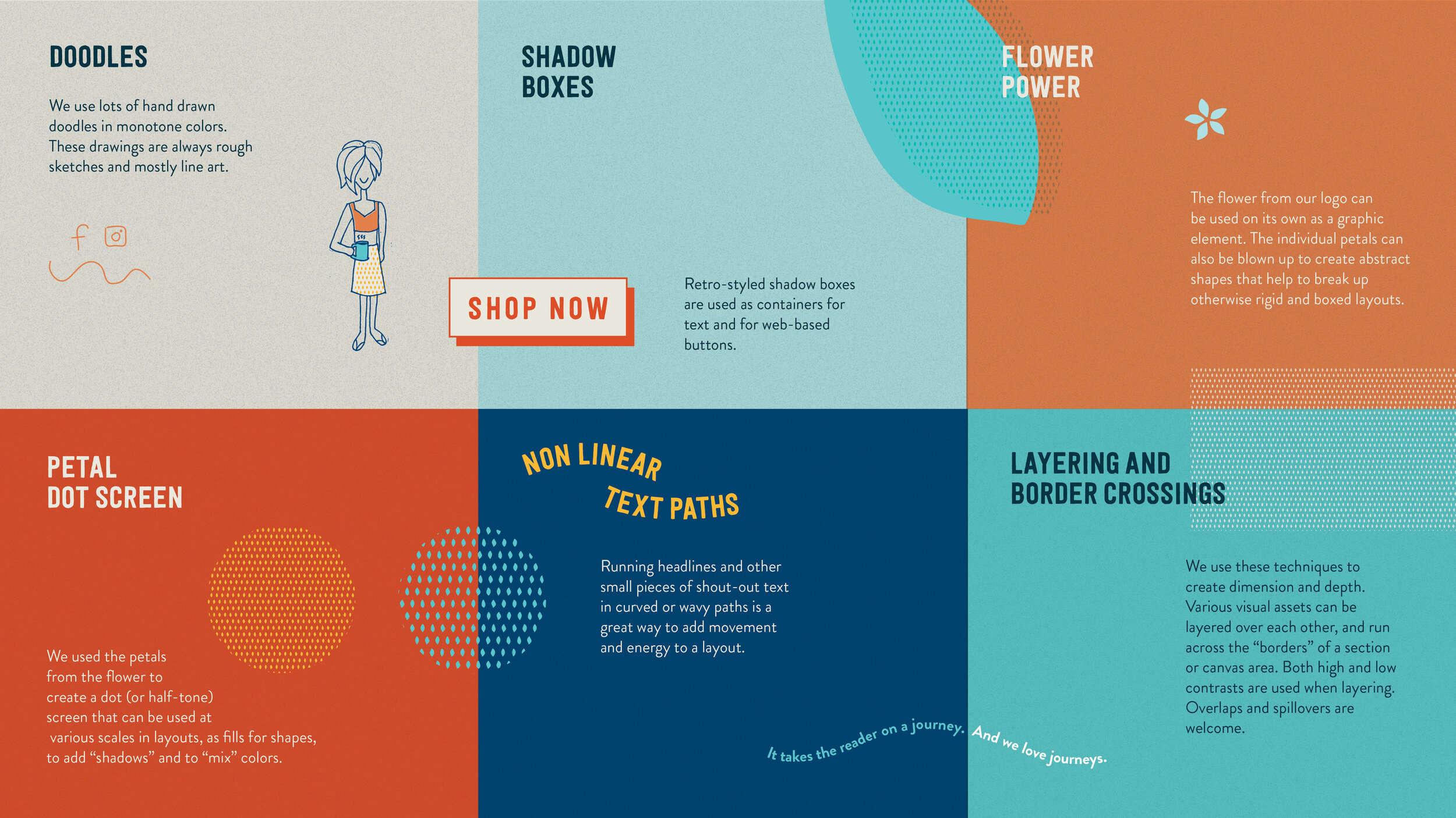
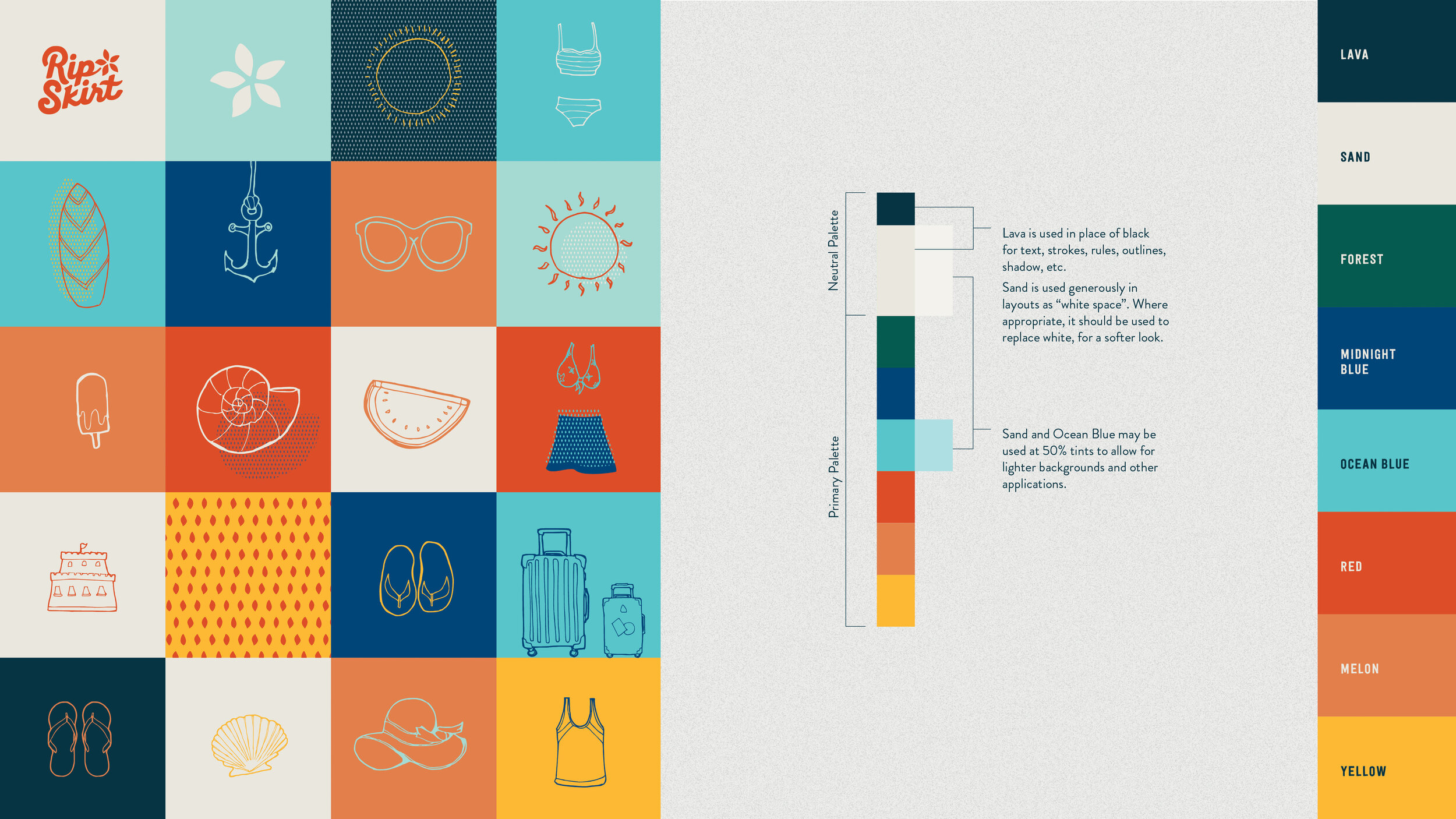
Motifs / Visual devices
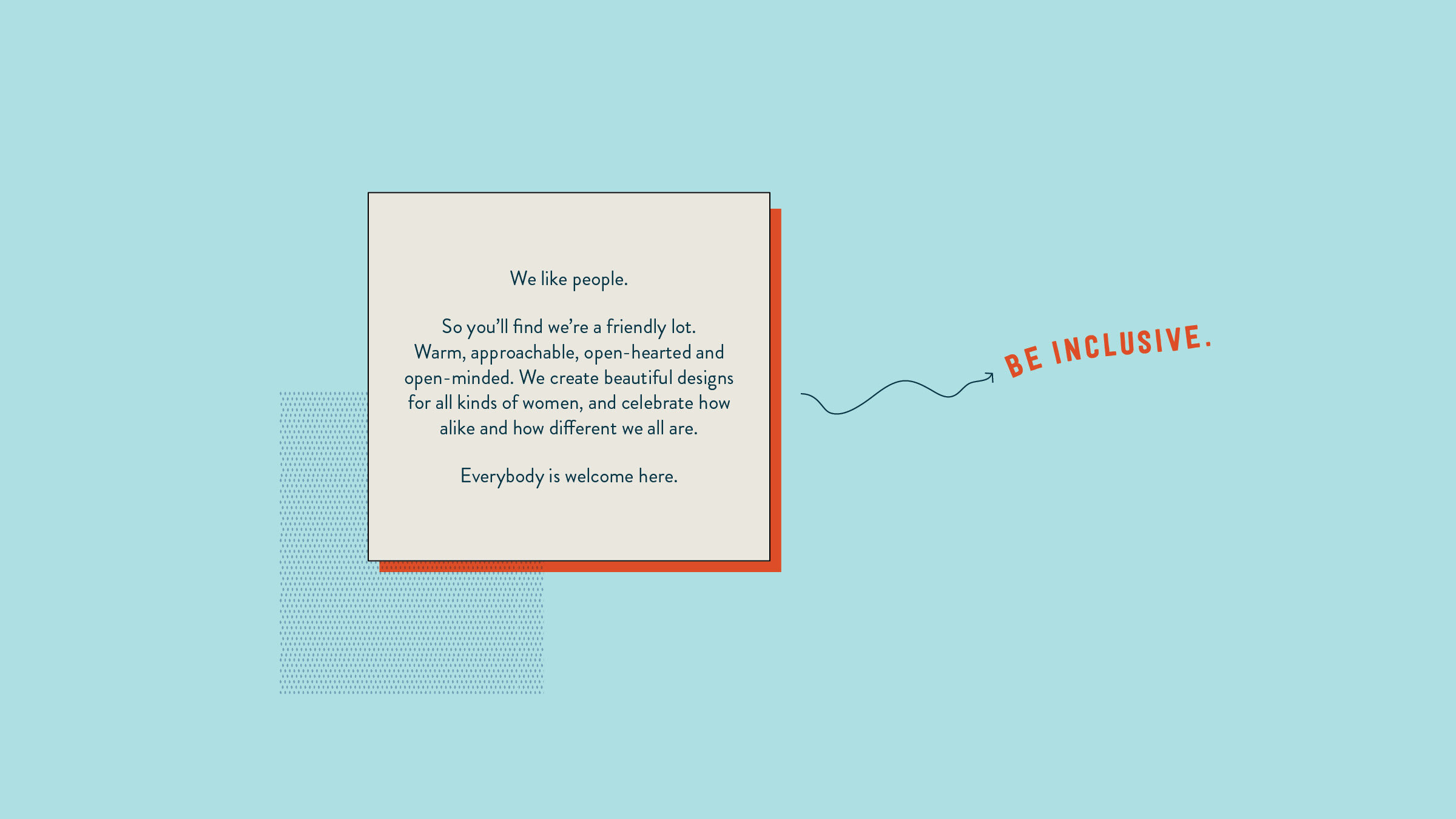
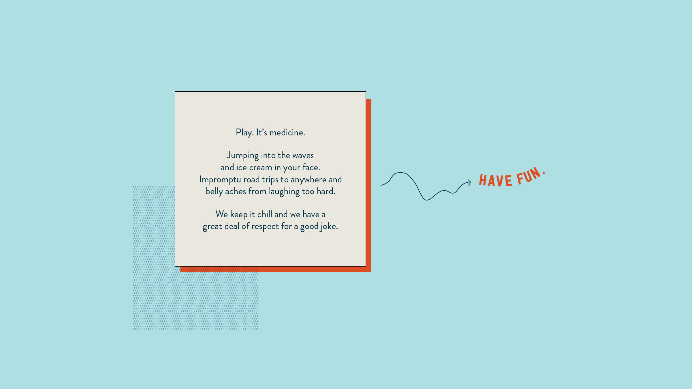
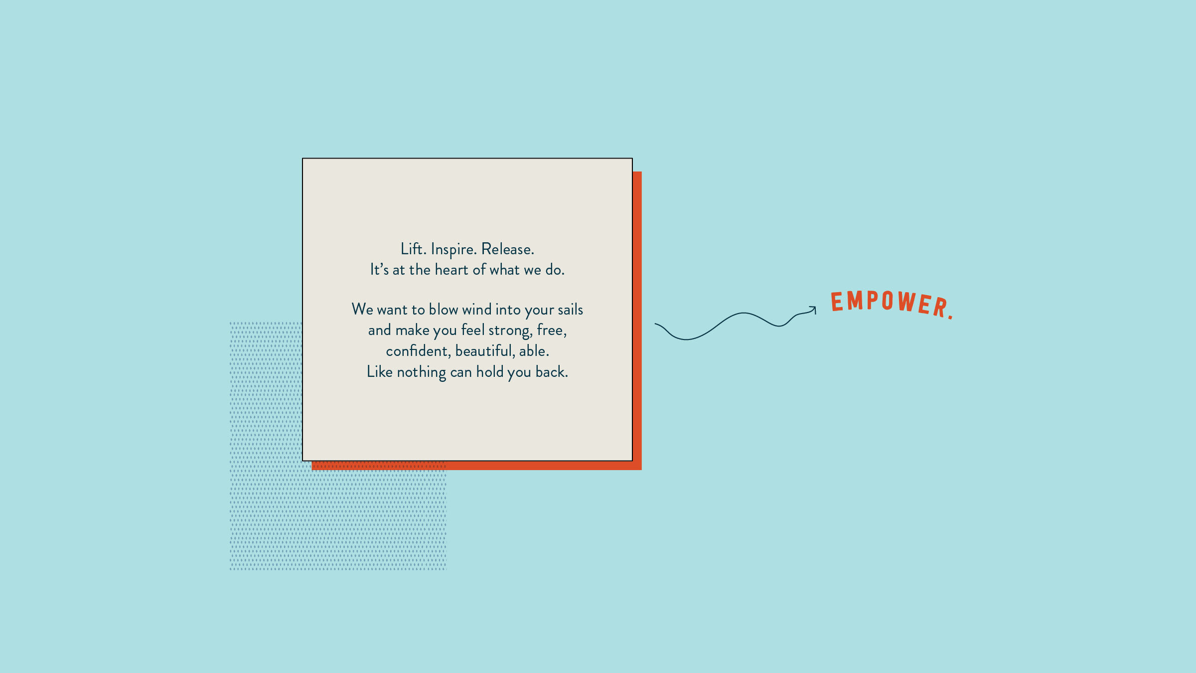
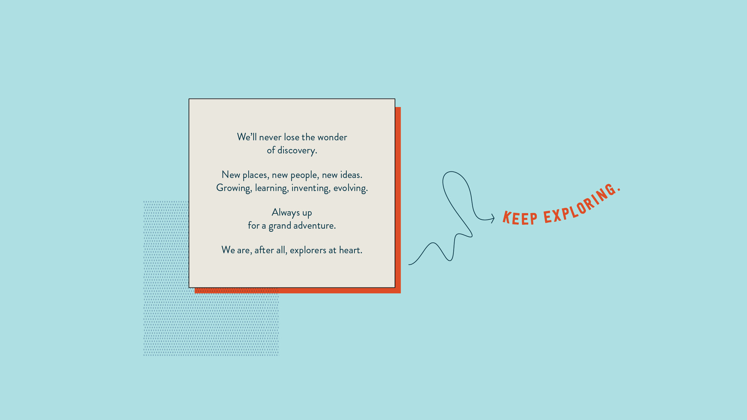
I used a bunch of visual devices to tell their story. These are fun and non-rigid aids that all play together nicely to give the brand its own unique look. Each of these capture key aspects of the brand’s values and personality. They are good-natured, lighthearted, strong, creative and unhindered.
type
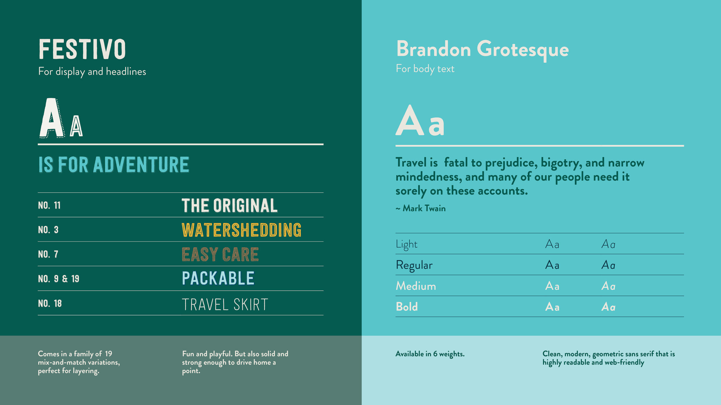
colors
I chose a broad spectrum of bright and and tropical colors, which worked nicely with the bright product prints. Most of the collateral exists only in digital space, so I kept that in mind and chose colors that would stand out on screen, but still allowed for muted compositions in print.
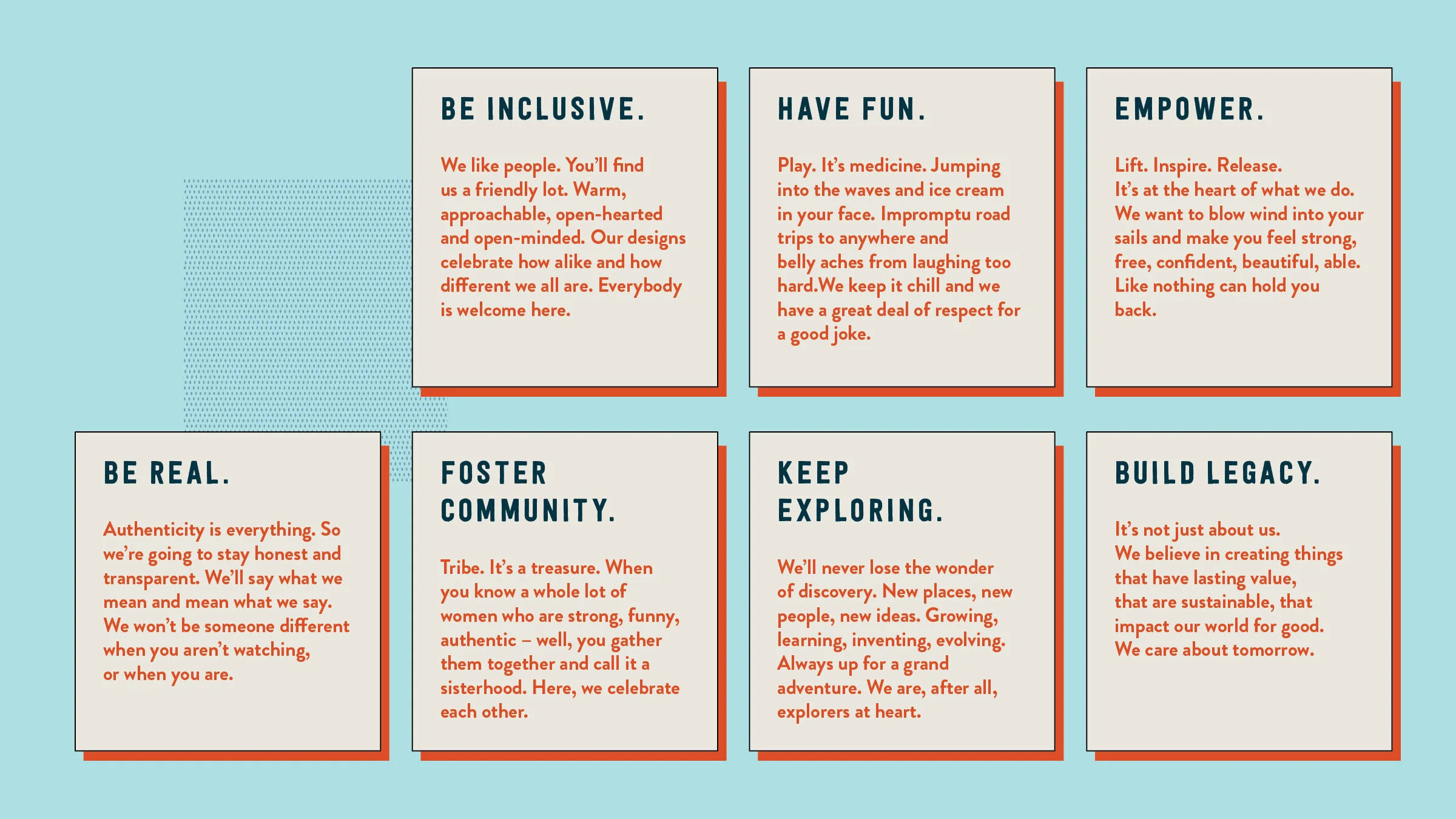
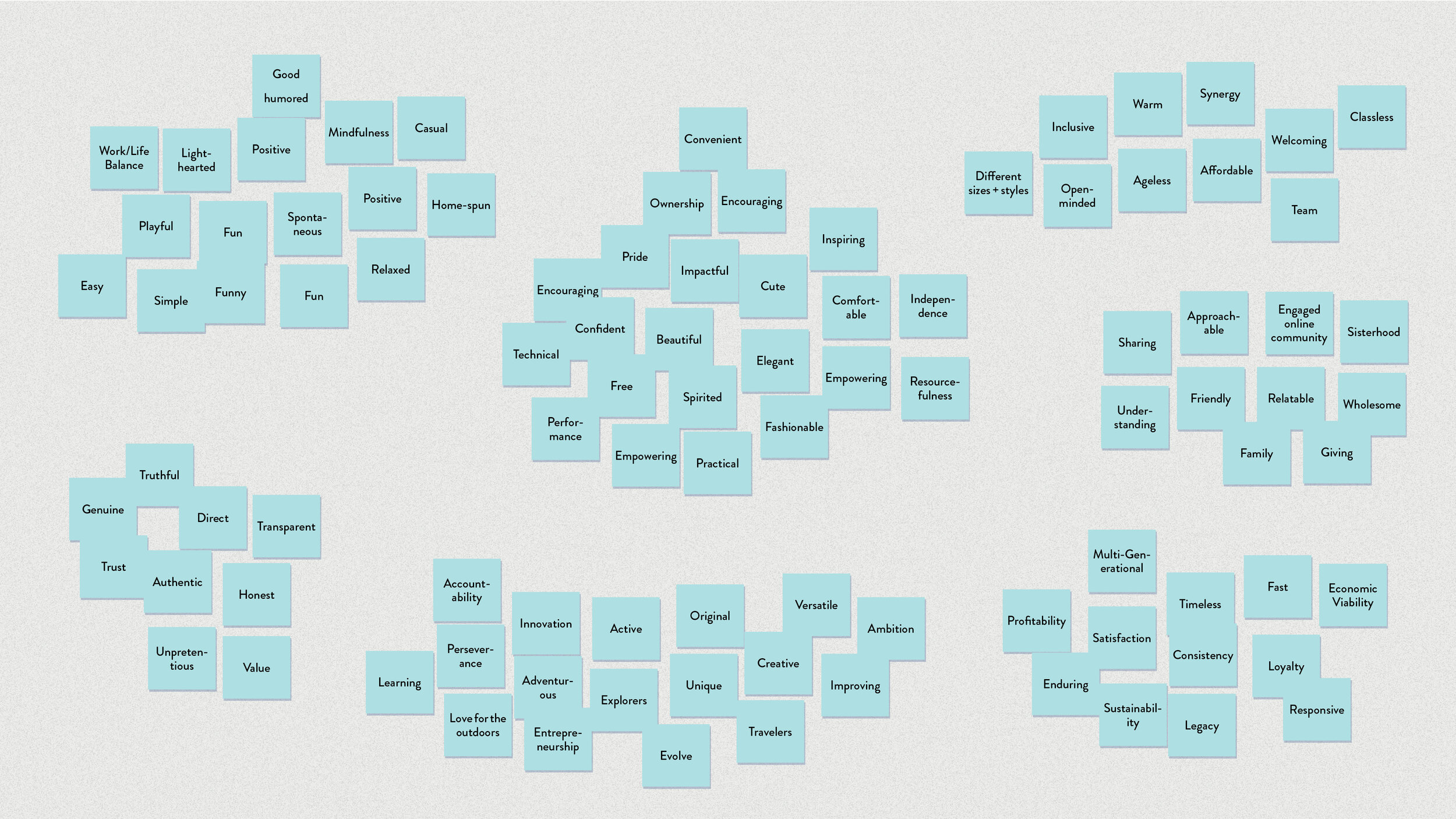
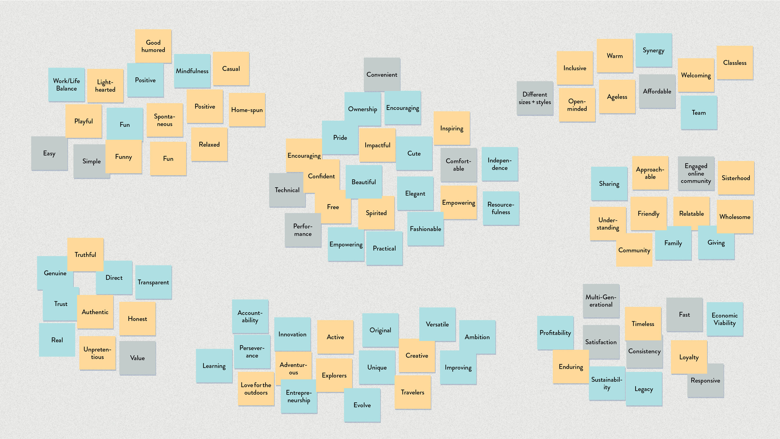
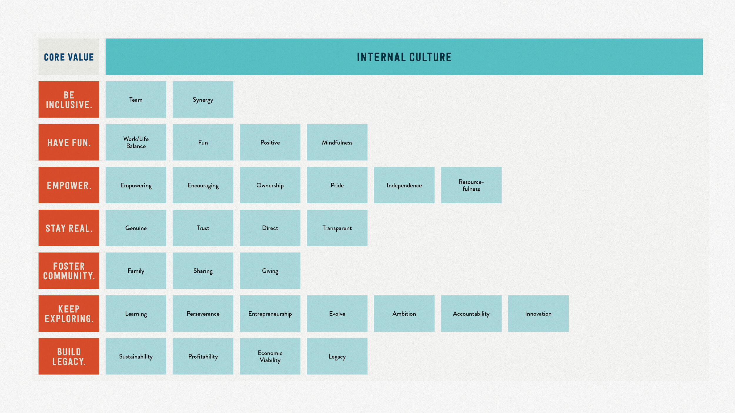
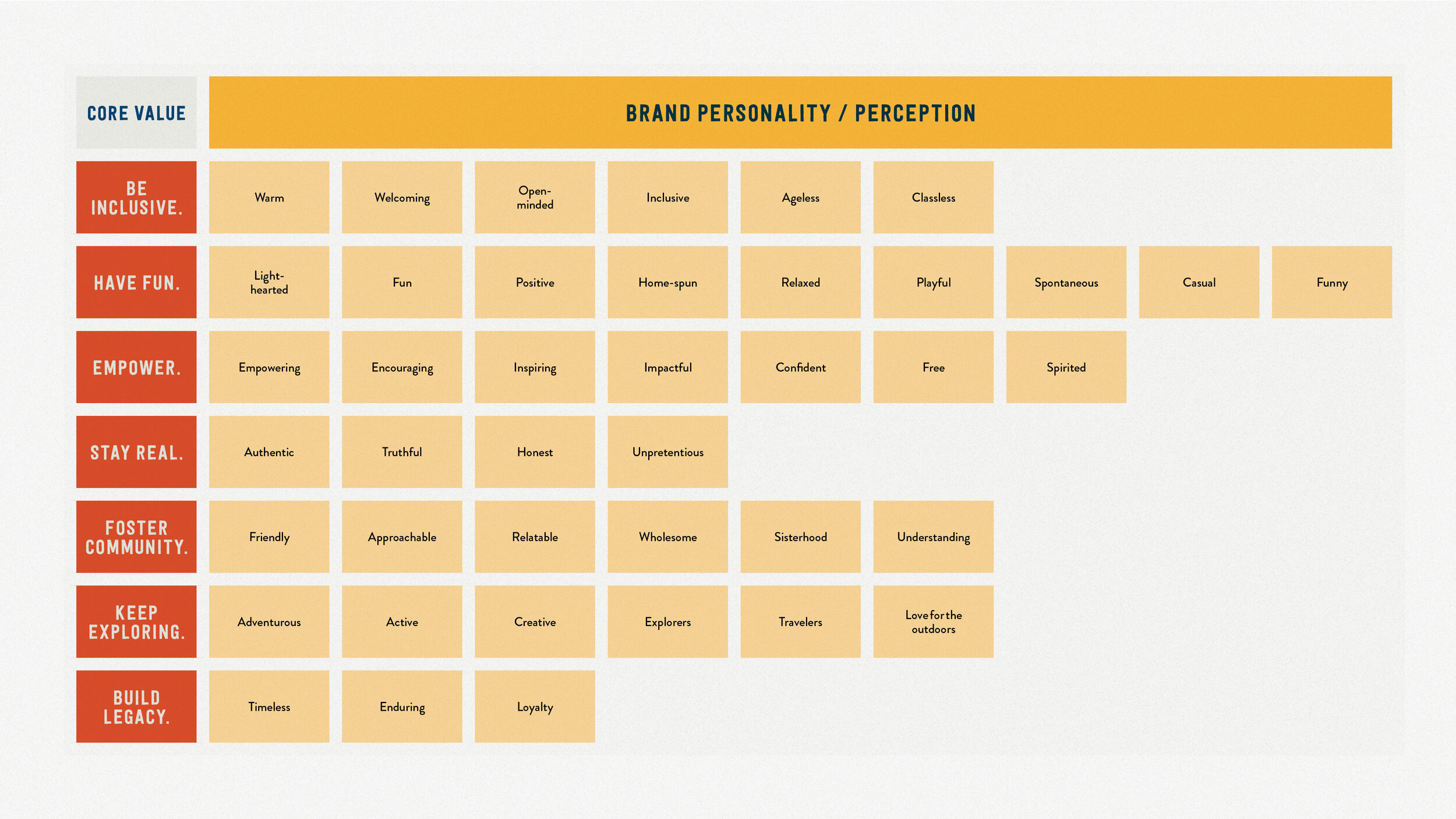
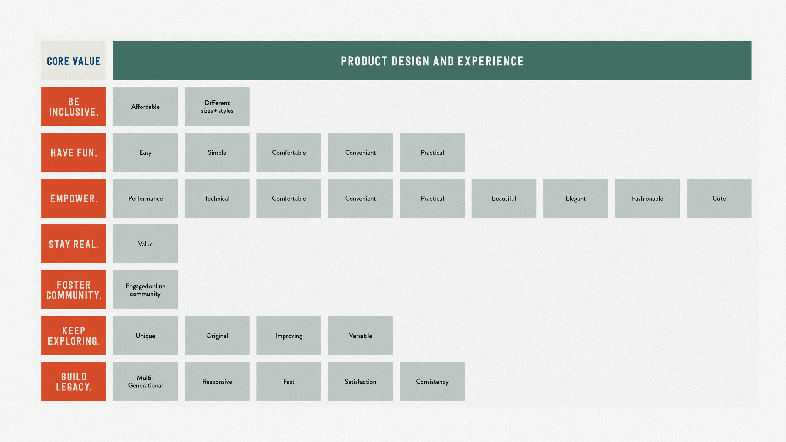
core values
Using a simple post-it exercise, we were able to distill the core values of the company down to seven clear axioms. We explored how these translated into the staff culture, brand personality, product design and customer experience. These seven became the compass that guided all our design and language.