Queen Kapi‘olani hotel
Designed while employed at Wall-to-Wall Studios.
Winner of 2020 Pele Awards (Addys, Hawai‘i )
for Art Direction & Integrated Brand Design.
brand values & language
Colours & Type
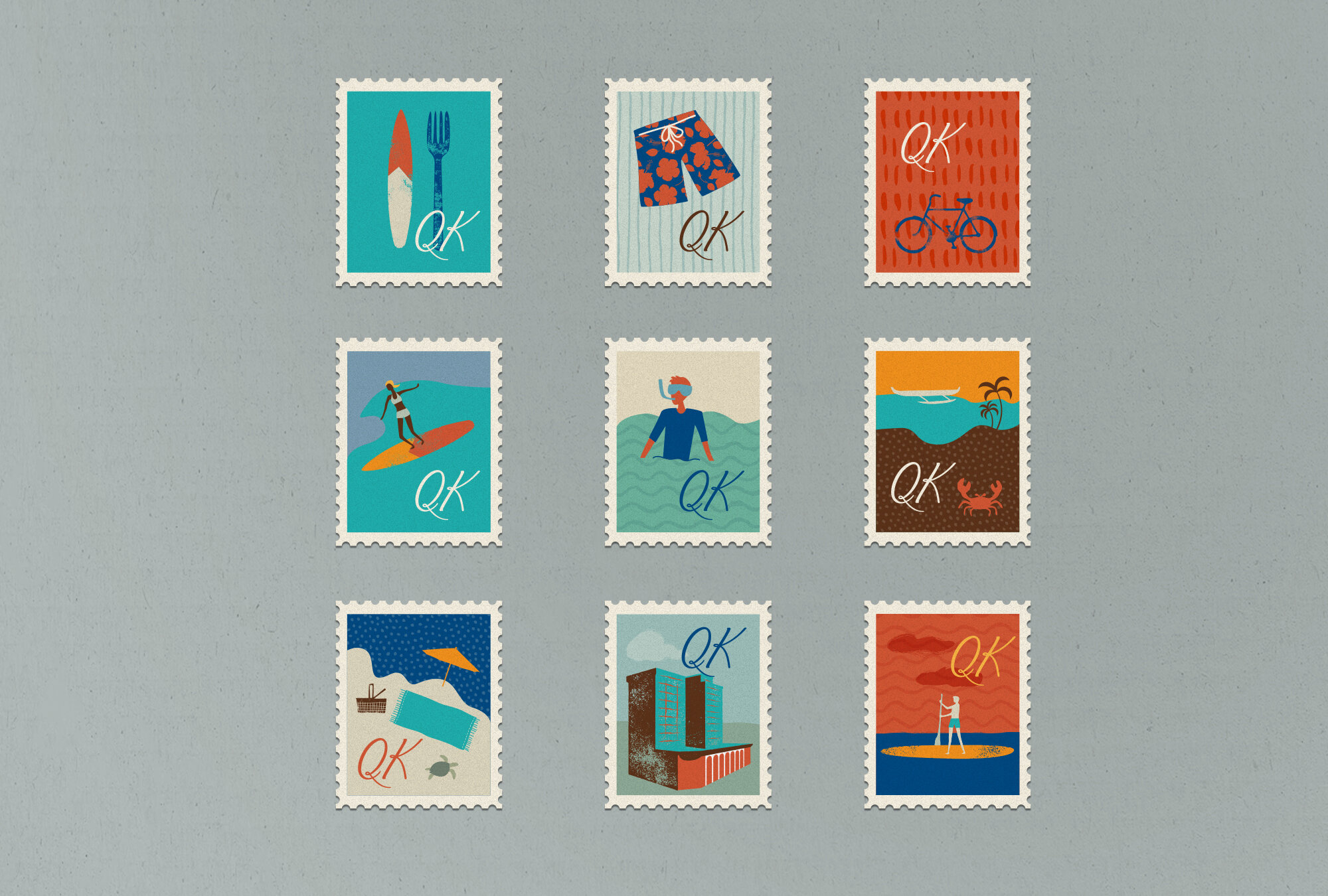
illustration & iconography
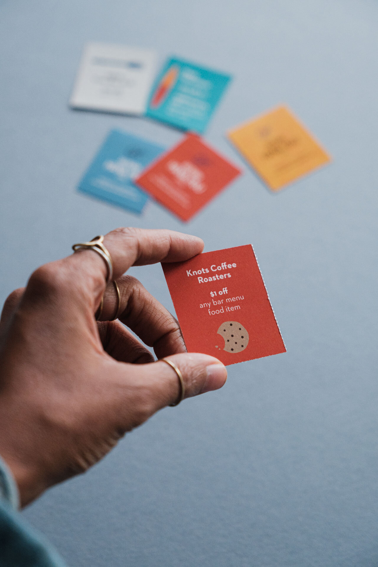
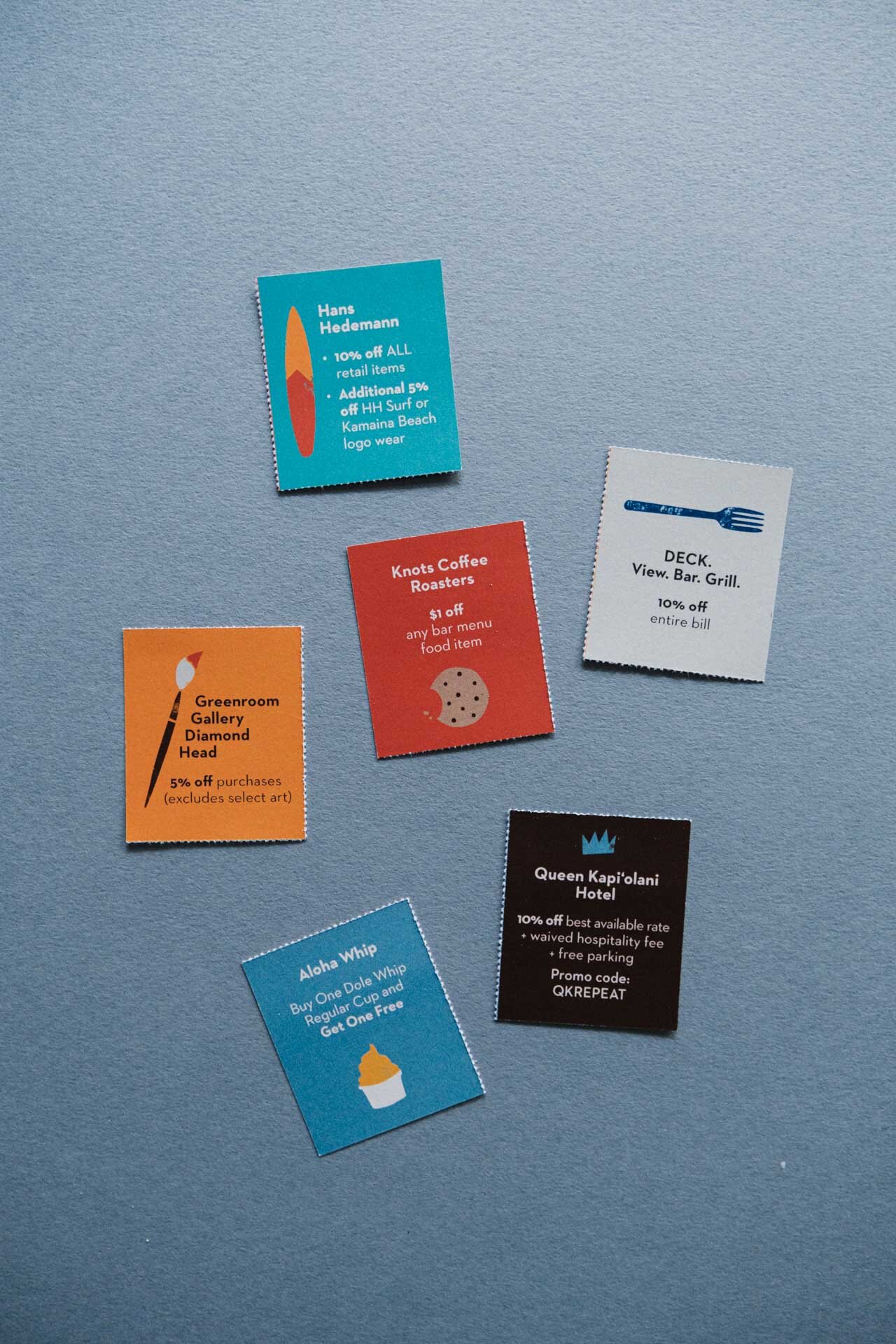
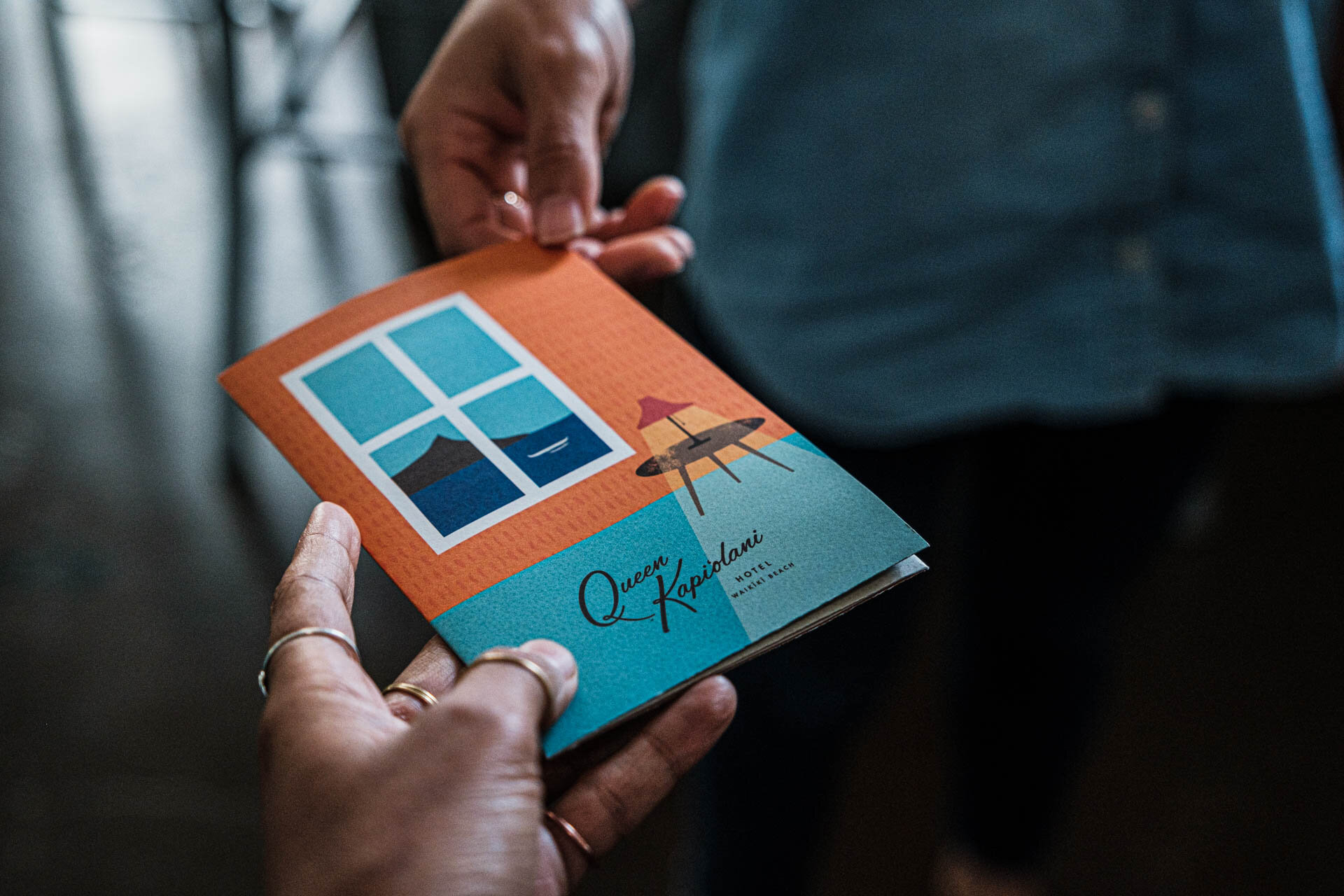
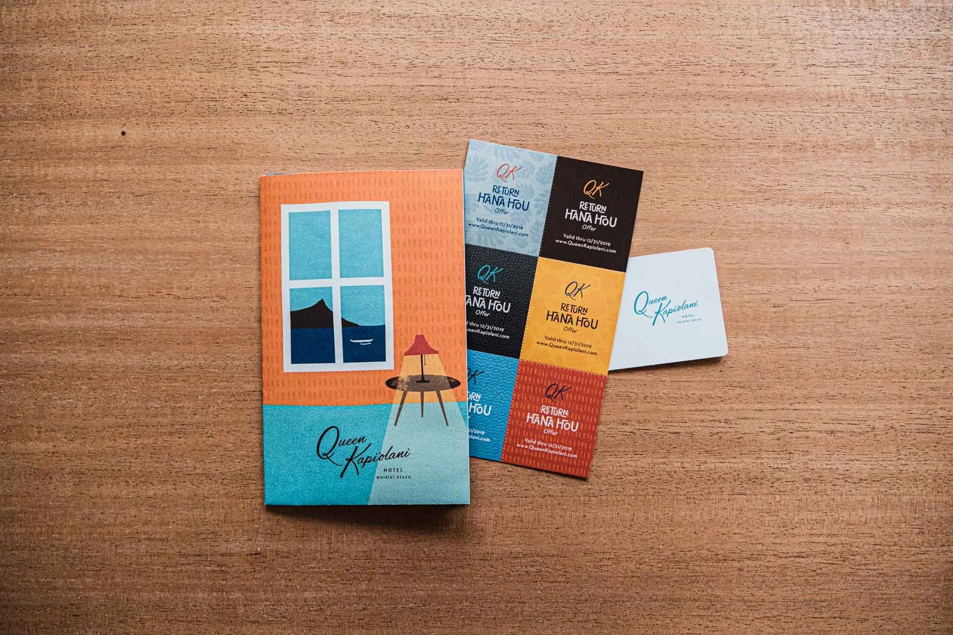
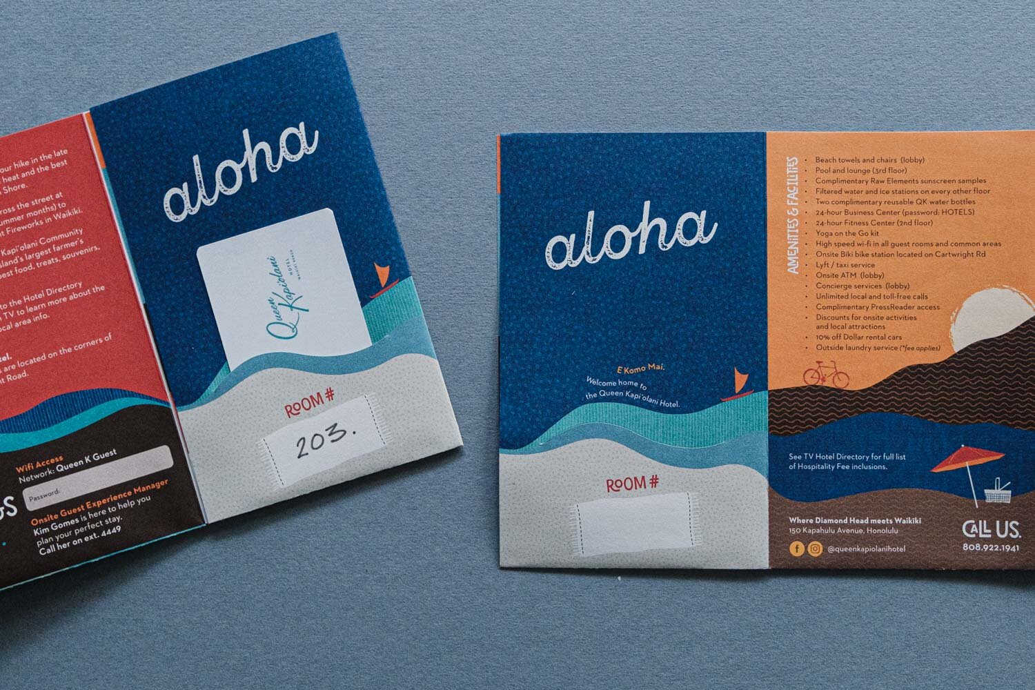
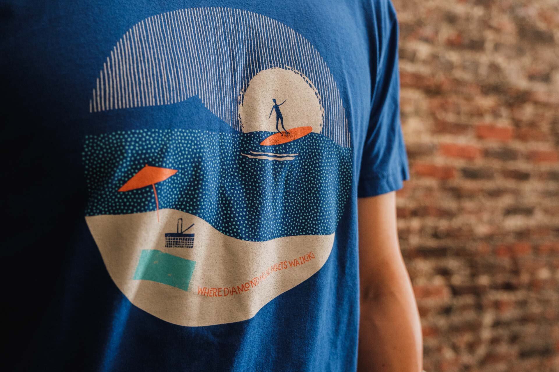
print collateral

background
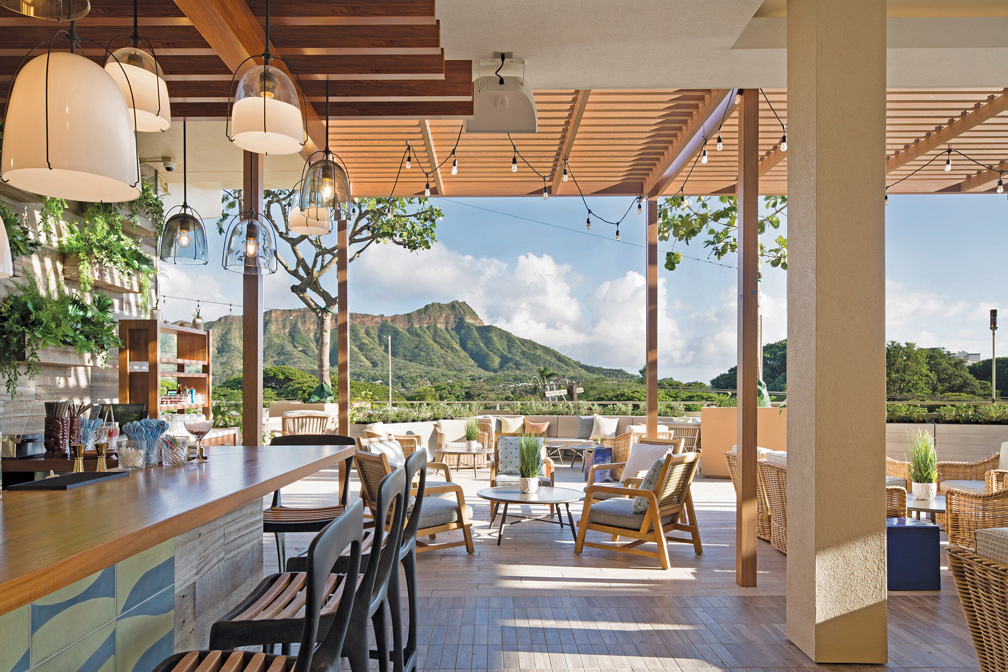
The historic Queen Kapi‘olani Hotel in Honolulu, famously located "where Diamond Head meets Waikiki", is known for its magnificent views of the crater rim. Built in 1969, the hotel had seen its heyday in an era when Matson steamboats were giving way to the advent of jet travel. But by the time the 2000s rolled around, the iconic landmark had aged somewhat less than graciously. While most locals remembered it with some nostalgia, it had gathered a reputation for being old, tired and stuffy. So in 2018, following a multi-million dollar renovation, the new ownership approached Wall to Wall studios for a brand audit and overhaul. I was the lead designer for the project and all concept, design, illustration and copy shown here are mine. You can see more of this project at Wall-to-Wall Studios.

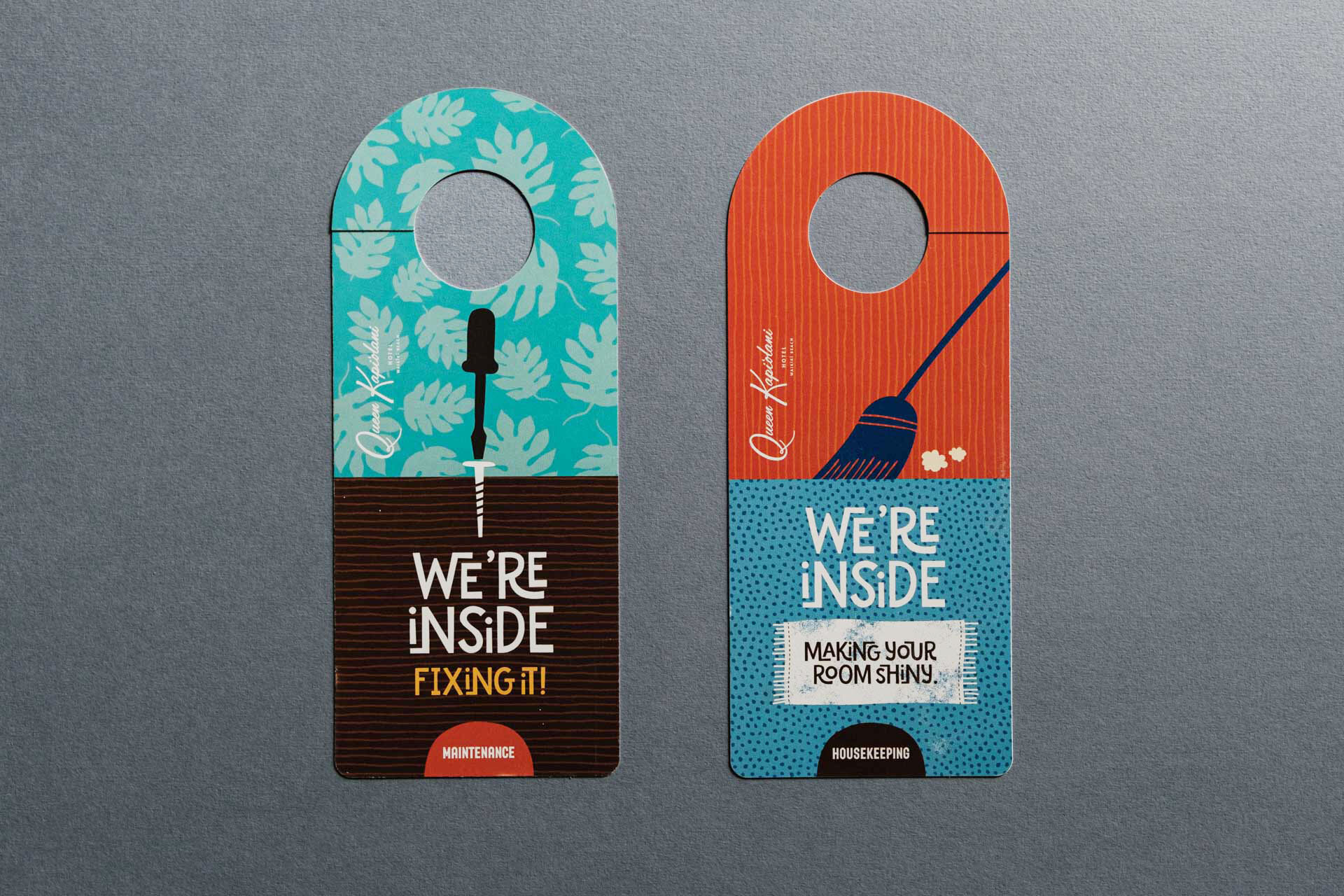
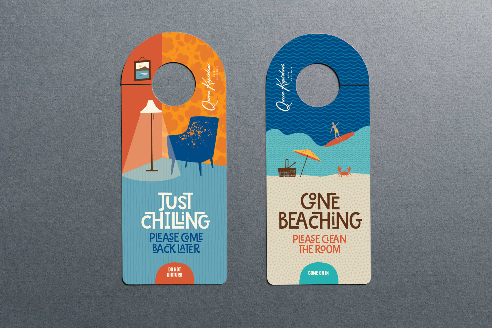
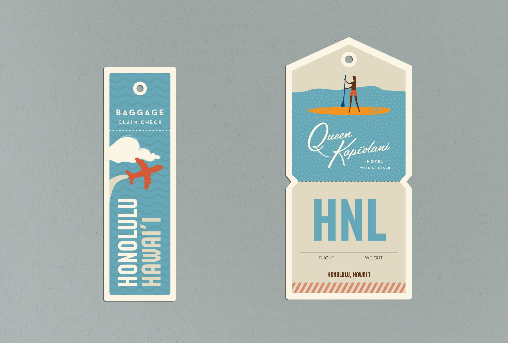
We kept their existing logo, but everything else was free game. We updated their colour palette to one reminiscent of iconic travel posters from the 60s and 70s, and created a library of fun, loosely doodled illustrations, that captured the light-hearted simplicity of island life.
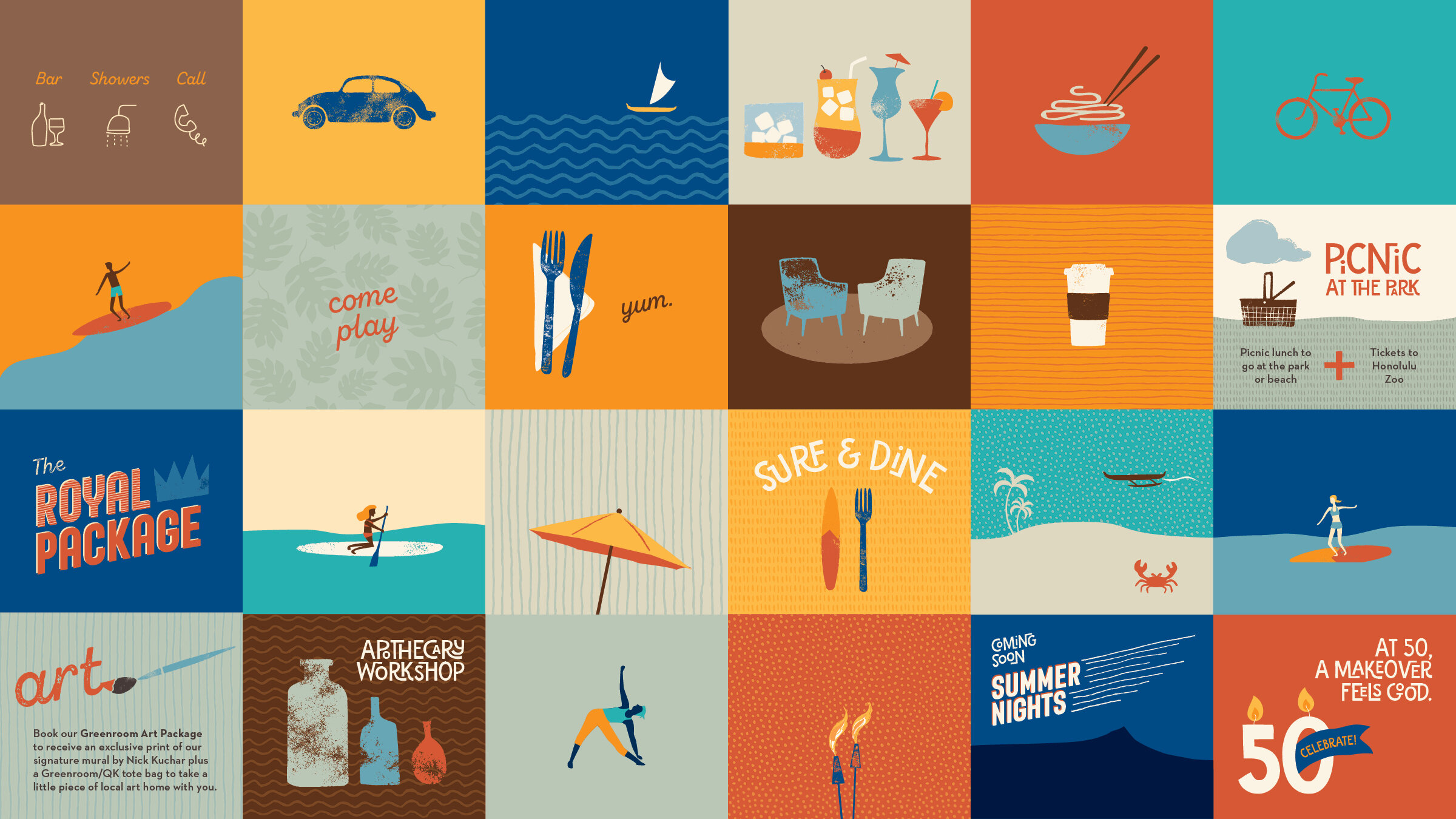

A bold mix-and-match of four font families combined modern sans serifs with mid-century type trends - rounded corners, heavy weights, fun interlocks and grungy script.
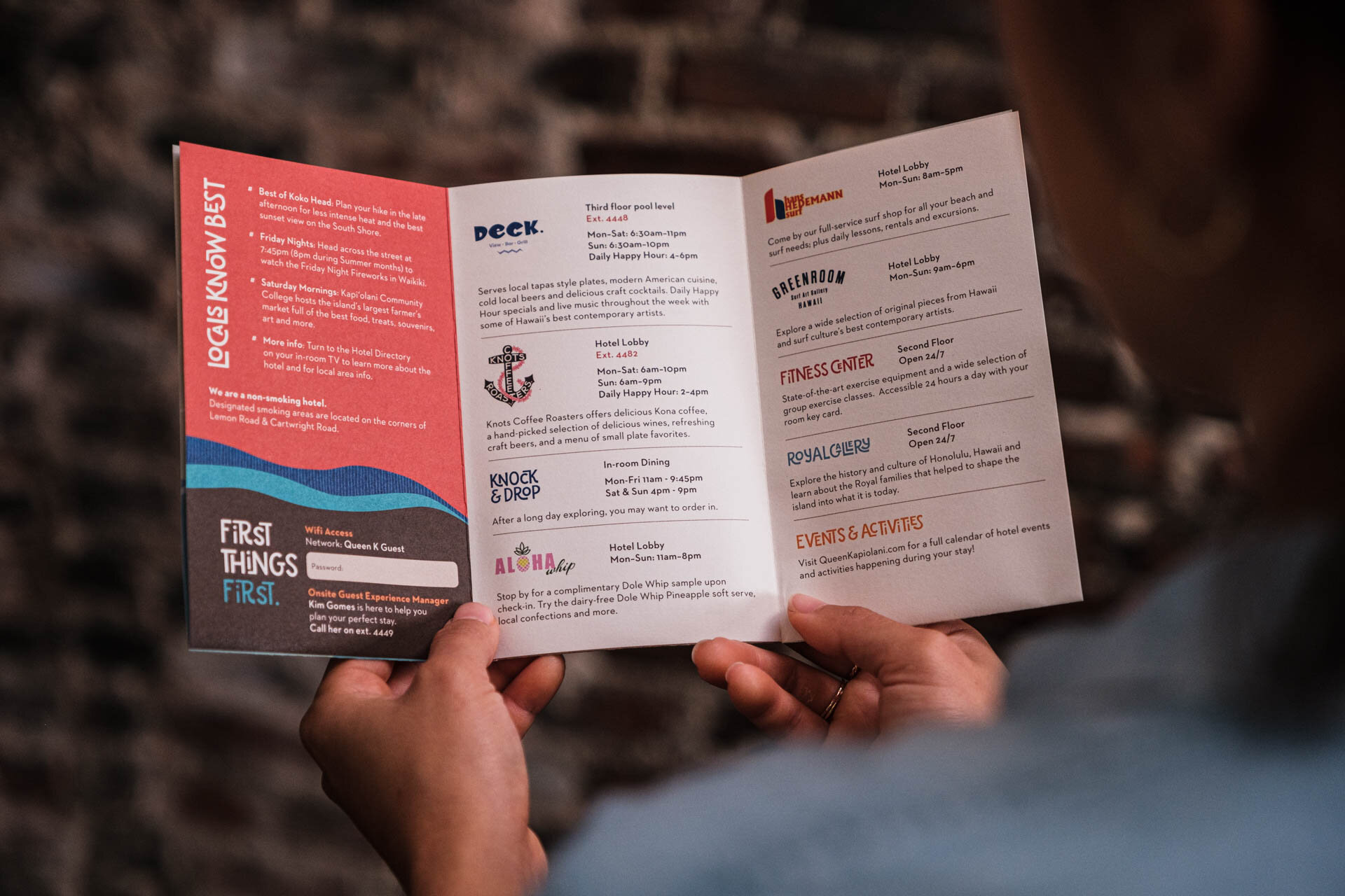
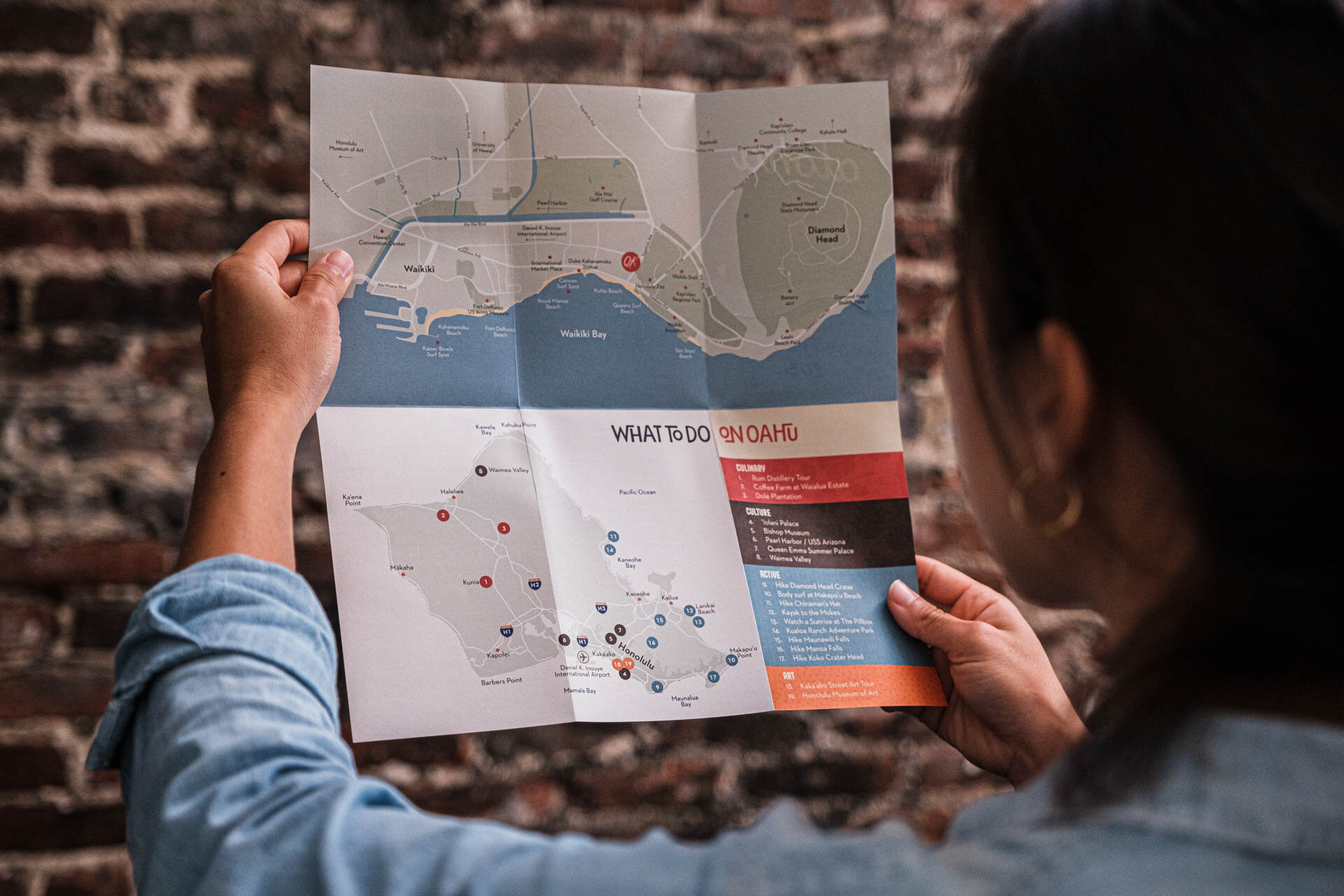
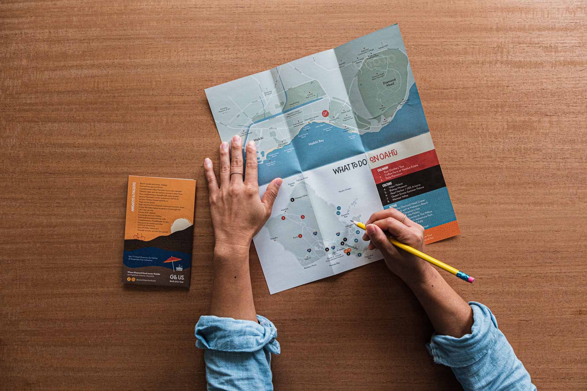
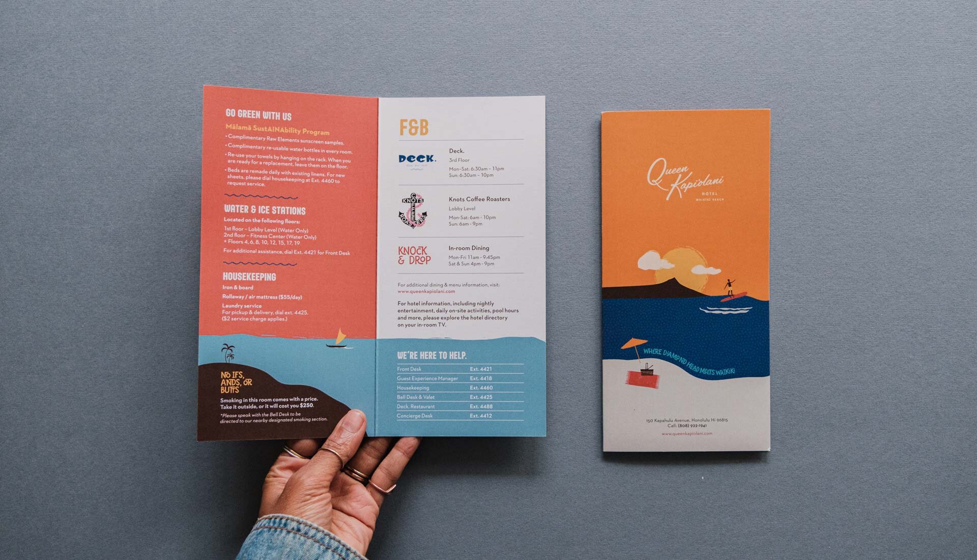
Fun, tactile collateral, printed on uncoated stock, brought it all to life.
behind the scenes:
researching and reclaiming the golden age
The owners wanted to rebrand the hotel with all the feels and nostalgia of “The Golden Age of Waikiki”. But as we dug deeper, we realised the phrase meant very different things to different people. Depending on whether you were asking a California surfer, the grandson of a plantation worker or a local historian, you got very different responses. And of course, it posed the difficult question - were the best years long gone? Ultimately, we re-framed it, not as an period of time, but as a way of life. This proved to be a position the brand could authentically own.


